Notifications
Client
plick
Industry
Tech, Ecommerce
Position
UX Researcher & UX Designer
Case
In a one of my biggest project, the UX team took on the challenge of revamping the notification system in the plick app, a vital component influencing key performance indicators (KPIs) and user experience. Despite the potential resistance to substantial changes, particularly from a young user base accustomed to app evolution, the team delved into this intricate task.
Challenge
The task was daunting on two fronts: implementing impactful changes without alienating users and conducting a comprehensive exploration combining qualitative and quantitative data, competitor analyses, and meticulous mapping of each notification's triggers.

UX Research
Our approach kicked off with gathering technical data; the frequency of notifications sent, user interactions with push notifications and in-app notifications, and demographics-related interactions, unveiling insights into user interactions with notifications.
For instance, we discovered that users were inundated with notifications, with 548,746 news notifications sent in three days, resulting in 40,162 clicks. This highlighted a considerable room for improvement, especially given that only 7.32% of the news notifications were visited. A detailed demographic breakdown revealed varying engagement rates, emphasizing the importance of tailoring the notification system to different user segments.
UX Research
Our journey began with the collection of technical data, unveiling insights into user interactions, revealing a high volume of notifications with a low 7% engagement rate, underscoring the need for improvement. Qualitative insights were garnered through surveys, with around 500 responses emphasizing the importance of the notification function. Survey findings revealed a strong desire for user control over push notifications and specific expectations for various notification types.
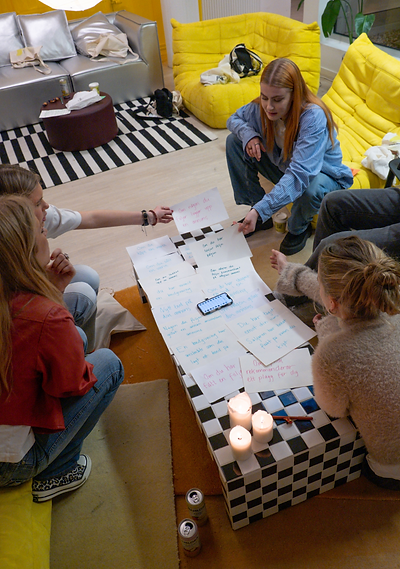
To refine our understanding, we conducted an user workshop, enabling us to explore user preferences. This session provided nuanced insights in user opinions, including surprises like users associating the bell icon with notifications instead of the intended function of saved searches. This prompted us to change icons for both functions. Importantly, discussions during the workshop unveiled users' strong emotions and irritations regarding biddings in the app, leading to the decision to dedicate further research to this aspect.


Design process
Simultaneously, design efforts focused on refining visual aesthetics and introducing structural changes. Initial visual enhancements included cleaning up the overall design, ensuring compliance with accessibility standards, and creating a user-friendly interface.
We also introduced a notification center, empowering users to filter notifications, and providing control over push notifications. Alterations to notification triggers, incorporating visual cues differentiating between user-specific and app-related notifications, were implemented while we were waiting to collect qualitative data, to save time. The restructured categories moved from "For you," "following," and "saved searches" to a simpler "Notifications" and "Saved Searches, since the data indicated that users did barely used the "for you section".

Solution
While the first iteration of design improvements is complete, the project remains ongoing. The collaborative efforts of the UX team, in conjunction with data-driven insights and feedback from users during workshops, have laid the foundation for a notification system that aligns with user preferences. The strategic integration of user feedback and data analysis ensures that each design decision is rooted in a deep understanding of user needs
and behaviors.


Other projects


Contact me